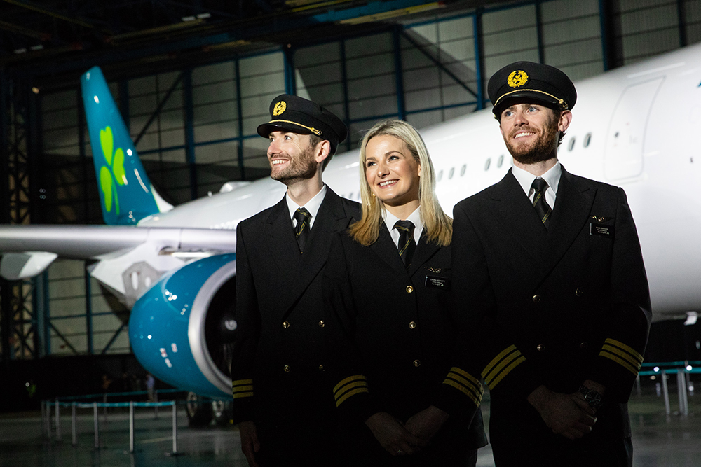
In what is one of corporate Ireland’s biggest brand overhauls in recent years, Aer Lingus has unveiled a refreshed brand with updated logo and new aircraft livery.
The new logo retains but restyles the iconic shamrock, adding a tilt to symbolise what the airline calls “dynamism and speed, with heart-shaped leaves reflecting the warmth and hospitality of the brand.”
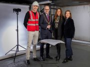
The brand refresh was created by Lippincott, the New York-headquartered creative consultancy which has extensive airline experience having most recently worked on Delta, Southwest, and Hawaiian airlines. The lead designer on the project was Dublin native Brendán Murphy who has been working with Lippincott in New York for over 20 years.
According to Mike Rutter, Chief Operating Officer, Aer Lingus: “The Aer Lingus brand has evolved significantly over the last number of years. Since 2015, we’ve invested significantly in our business, improving our value proposition and overall guest experience and becoming Ireland’s only four star airline. Innovations that we have introduced include the roll-out of WiFi on our A330s, automated check-in and bag drop at Dublin Airport, Business Class improvement with fully lie-flat beds and economy catering upgrades. We’ve also enhanced our performance to become the most punctual airline at Dublin Airport.
“We conducted extensive guest research across Ireland, Europe & North America to inform every key stage of the process to ensure that the brand revealed today is reflective of our value carrier positioning. This research confirmed the importance of our shamrock – the Irish emblem has been at the heart of the Aer Lingus brand for more than 80 years, and we made the shamrock ‘hearts’ more pronounced to reflect our hospitality and service.
“The new look Aer Lingus livery consolidates our position as a modern, contemporary Irish airline on the international stage, but also allows guests who have always loved our brand to maintain a positive affiliation.”


